rwloadsim
Sample use cases with the oltp workload
Your distribution of the RWP*Load simulator includes a sample OLTP workload
that is vaguely similar to swingbench.
The complete documentation on how to prepare and run it is found
as rwlman pages after installation; start with rwlman oltp.
The description here discusses some of the possibilities.
When you start using the oltp workload, you are defining one (or maybe a few) “projects”. Such a project has settings like databases to use, overall size and may other run conditions. Your project can then be used with these three primary types of execution:
- Single executions with various possibilities for changes
- Scaling executions consisting of gradually higher load
- Continuous executions that run the same workload for hours or even days and months
Single execution
When you start a single execution using the oltprun command, you have the option to change a number of parameters that define the run, which is done via the project configuration. The oltprun command itself has two primary options: The run time and the load. The run time is simple the execution time (say 300s) and the load is defined by a number of processes. Each process will normally have a relatively small load against your database, so the process count is the single most important adjustment of database load.
After execution, a complete html report will be generated which includes things like awr reports, potentially a list of ORA- errors and various graphs. One of these graphs will show the throughput through the run together with the database cpu and time. This is a sample of such a graph
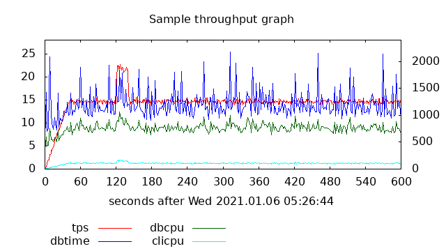
The x-axis shows the 600s that this run lasted; database cpu and time are shown in green and blue against the left y-axis and the throughput is shown in red against the right y-axis.
There will also be a graph that shows session counts; on the database side these will be shown per instance, and on the client side the count of open and active sessions in the session pool will be shown. An example of this graph (from a different run than the above graph) is shown here
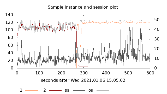
The total database session counts are shown against the left y-axis and in this example you can observe that there is a switch from instance 2 (brown) to instance 1 (orange) about halfway through. The number of open (pale gray) and active (dark gray) sessions in the primary client side session pool are shown against the right y-axis. As for the previous sample graph, the x-axis shows the whole run time period.
Another graph that will be produces is from active session history during the run. A sample of such a graph (again from a different actual run) is:
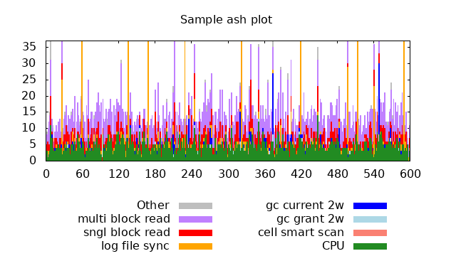
The y-axis is the session counts, and the differently colored bars are database cpu (green) together with the dominating wait events in different color. (In this sample, the wait event names are abbreviated.)
Scaling execution
It is often desired to find the maximum reasonable load against a database; this is what scaling is about. If you execute a sequence of single execute runs with increasing load, that is with increasing number of processes, you will at some load experience a degradation in performance. This is popularly often referred to as the “hockey stick” curve. The oltpscale command is created to do exactly this. Once you have adjust your project parameters such that e.g. a single run with some process count has a very low database load, the oltpscale command can be used to perform a sequence of runs and in the end create scaling reports. These reports will contain links to individual reports, awr, etc, and will contain graphs that show scaling. An example (with a very low load per processes) of such a graph is
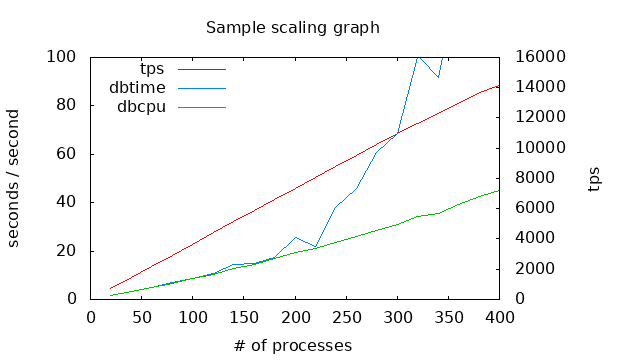
The x-axis is now the number of processes with the red curve showing throughput against the right y-axis. Database resources, cpu (green) and time (blue) are shown against the left y-axis, and it is clear that beyond around 250 processes, database time increases rapidly.
Another way to visualize the lack of scalability is by looking at how long the execution time is for individual business processes. This can often be matched to service level agreements that may state that some percentage of operations must be faster than some limit. The following graph shows exactly this for some business process.
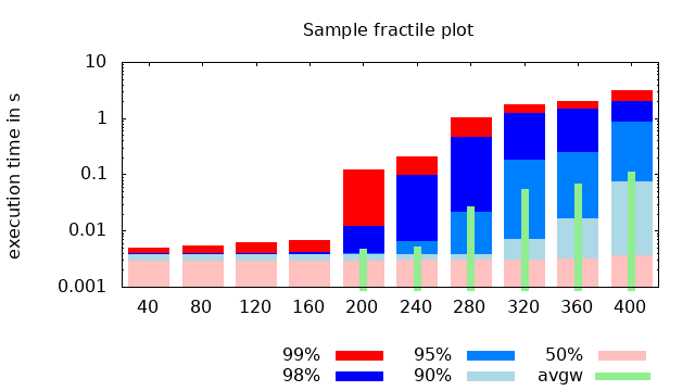
Like the previous graph, the x axis is the process count, and the y-axis is execution time. The time is grouped into fractiles at 50%, 90%, etc, and as an example, the bar at 240 processes show (approximately) that 50% were faster than 4ms, 90% faster than 5ms, 95% faster than 8ms, 98% faster than 0.1s and 99 faster than 0.2s. These times all include both waiting for a session to become available in the session pool and actual database time. The green narrow bars show the average time waiting for a session pool. We can therefore tell that for fewer than 200 processes, there was always idle sessions in the pool. Depending on the actual service level agreements, you can also estimate the highest allowed load. Other observations are that it surely is possible to perform the business process in 4ms of database time, and that even at the very high load, there are executions that fast. However, at the highest load of 400 processes, some executions of this particular business process lasted 4s.
Navigation
- index.md Table of contents
- MISCUTIL.md Previous topic: Miscellaneous utilities and include files
- OLTP.md Next topic: Setup and use of the oltp workload